John Hilliard: Aniconic Photography
Posted on June 23 2021


These are some of the crucial questions that artist John Hilliard (1945, Lancaster) asked himself at the dawn of his career. Are the status and reliability of photographs as representations the author's focus or can we go further? The essential components of photography - time, light and movement - are presented in his works through an investigation that is as analytical as it is iconic, that leads the objects of analysis to be the subjects of the photography themselves. In the 1970s, he produced modular pieces that used shutter speed and aperture, and in 1975-1976 he worked with differential focus. Then he became interested in the density difference in black and white film.
The use of photography in order to build some kind of similarity is strongly challenged here. Hilliard's methodical work is instead a praise of the specific qualities of the photographic medium: one of his most successful works consists precisely in a camera that records its own condition (Camera Recording Its Own Condition, 1971).
The position of this author is ambivalent: on the one hand there is the problem of the image, but on the other it is also something extremely seductive. In some of his works, seduction has been contrasted through abstraction, "evacuated areas" in which the photographic recording is interrupted, giving the viewer the illusion of entering the pure space of the image. But here also parentheses towards other means are introduced: painting and cinema in particular.
In 1975, in Depression / Jealosy / Aggression, Hilliard investigates the conventions of the cinematographic frame usedas if it were thought in the same way as the images in a photo story.
The framing of a same scene, with three different solutions due to different focus points between foreground and backgrounds, suggests three possible narrative readings. Starting from aspects taken into consideration by the structuralist cinema of the late 1960s, or with the belief that the movie camera or photographic camera could only apparently function as a neutral tool, he begins to investigate the process by which the viewer perceives an image as a result of a technical apparatus. And the investigation has been going on for over forty years, with various declinations and passages from an analytical approach to a more expressionist style, in terms of color, with monochrome portions, taken from paintings or figurative images to also probe the presence of aniconism , being even prepared to accept unnecessary aspects, errors, irruptions that may occur: other openings of the possible.

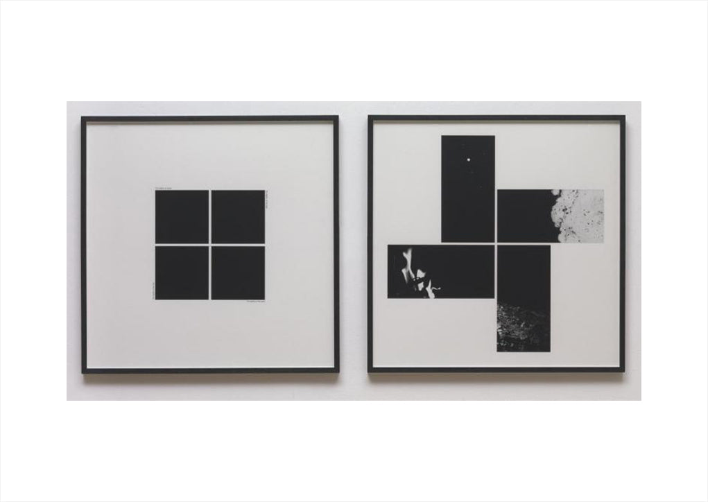
John Hilliard: It is very common to come across a photograph accompanied by some kind of text.
Even a single word has the ability to influence our interpretation of an image, and in this case I wanted to examine the parallel effects of both the cropping of the image and the juxtaposition of differently modified versions of the same photograph in combination with different words. The words themselves and the directions of the cutouts refer to a Platonic ideal of earth, air, fire and water, and were selected accordingly. Of course, no matter how predetermined the choice, what happens when images and words collide will also be highly subjective, and will therefore exceed the restrictive control of 'language'.
You were the first to pose the question. How could photography visually render the abstraction that precedes any type of representation?
In 1974 I produced three works: Black Depths, White Expanse and Gray Extent, made shortly before Cause Of Death ?. They also involved the cutting out of prints, the use of captions and the Platonic structure, and were exhibited for the first time that year at the Galleria Toselli in Milan.
They included, respectively, squares of pure black, pure white and a medium gray - the zero points of black and white photography, reducing its ability to represent and highlighting its material presence. This use of monochromy has appeared periodically in my works from the late 1960s to today, reflecting a certain minimalist and reductive belonging. Debate (18% Reflectance) is part of a group of works created between 1994 and 2001, in which an opaque, rectangular and monochromatic device occupies the largest and most central area of the image, deliberately preventing the viewer from entering the normal "window" of the photograph (if not on the edge), and colliding instead with its two-dimensional reality. There is also a shift in the elements of the image, so that an empty or featureless area is the center of attention, and the more lively components are relegated to the edge. Yet, can the photographic monochrome alone, with less material presence of its painting counterpart, survive the scrutiny of a prolonged gaze? For now, I've sidestepped this question by placing my monochromes as components within a larger whole.

With Off Screen (5), in 1999, you went further towards the aniconic solution: a pigment print on a museum poster, a white rectangle on a larger black rectangle. The gaze here instantly links this print (with the inversion of black and white) to the emblematic painting by Kazimir Malevich, the Black Square (1915), a manifesto of Russian suprematism. According to Malevich's intentions, his painting should "evoke the experience of pure non-objectivity in the white void of a free nothing". He does not seem to be very far from the intentions of Robert Fludd, who imagined the nothing before the universe as a black square that expands infinitely. What is in Off Screen (5), compared to the previous aniconic ones?
Off Screen is, in fact, an example of one of those works related to Debate (18% Reflectance), but it is not completely reductive. The white projection screen in the center actually refers to monochromatic painting, and is in fact made of canvas, but in addition to its black border there is a secondary border: the series of figures are around and beyond the screen itself, as if the image that we might expect to see on screen has now been blown off the screen, leaving an emphatic void as our central subject. Here there is a desired hybrid, between the abstract and the figurative, the opaque and the transparent, the center and the edge, and between painting and photography (with an added reference to cinema). So, once again, I have taken a step back from presenting just a pure white void, contextualizing it instead within a more variedly structured image.

There is, once again, a reference to painting in these works. Some use images of old master paintings in museum interiors, but, more generally, a selective color palette is taken from each photograph and relocated into it as an abstract equivalent of the underlying painting. The colored rectangles are in fact small details of those images, greatly enlarged in order to have an almost pictorial consistency and also the structure of the film grain.


Could you talk to us about Seascape In Two Whites And Three Grays (2015)?
The three photographic zones that characterize this black and white image (sand; water; sky) are reduced to their three medium grays, and further reduced to a schematic representation of a seascape - three horizontally elongated rectangles. There is also a confluence of daylight and sunset shots, hence the title. The view is in Cumbria, in the north of England, where I have done numerous landscape works.
What does a prescriptive drawing represent to you? How do you use drawing or a short piece of writing in relation to photography and a new idea to be translated into work?
I usually have a particular set of ideas from which I produce a work or series of works. To clarify how this might be accomplished, I sketch out some possibilities on paper, perhaps in the form of sketches and diagrams, or as written notes, or as a mixture of both. I can get to making a prescriptive drawing that traces a complete photograph before it was even taken, or I can just make a rudimentary scribble. Sometimes my original sketch is strikingly similar to the finished photograph and other times it isn't. As close as the two are, all kinds of accidents and unforeseen developments separate the finished work from its origins and allow it to have a life of its own.

By adopting something similar to a modernist approach, where the material specificity of the medium itself is encouraged, not suppressed. Thus, sharply defined grain, dense pools of dark underexposure or arid gaps of overexposure, linear streaks of motion-blur or out-of-focus mists - all insist on presenting the photograph itself as an object and not merely a vehicle of its image. Both functions are important, of course, just as in figurative painting the brush strokes and marks left by the palette knife give vitality to their subjects. Photography does a great service to the realm of images, but it can also claim its place in the world of objects.


Following mostly artists who use the photographic medium with a conceptual approach, when we relate to documentary, fashion, architecture, advertising or fine art photographers (John Szarkowski defines them as photographers in the Museum of Modern Art), we are often asked what is the difference between photographs by photographers and photographs by artists.
We usually reply: Can't you really see the difference? At times we have replied that the photographic works of artists offer themselves to a form of deconstruction that is part of the pleasure of looking. At other times we have tried to enter into conceptual issues, trying to overshadow the aesthetic or expressive aspects. What would you answer to this recurring question?
Italian painters of the early Renaissance period were mostly artisans, who simply worked with orders by a patron, but some of them managed to do it with a high level of skill and originality, in the same way that a commercial photographer is hired to serve a client's needs could go beyond the brief and produce something extraordinary. Unlike painting, a method normally used only by artists or decorators, photography is used in many different fields. It is used to record crime scenes, medical conditions, stars, passport portraits and sporting events. It is used in advertising, journalism, fashion and family snapshots. From any of these contexts (and more) we can find examples of images so interesting, so unusual, that we attach special value to them and consider them an art form. Artists have made their contribution, of course, and I would say that since the 1960s the prevailing feature of their photographic work has been a commitment to the realm of ideas. In this sense it is different from the dominant types of photography whose primary purpose is documentation. This does not mean that artists' photographs are by definition better, or more valuable, or more interesting than others - simply different. My preference is for a job that at first captures my attention through a compelling image, then rewards this attention by engaging my intellect.
.
.


Connect